Make up per il matrimonio: i segreti per stendere il rossetto

make up matrimonio stesura rossetto

Rossetto sì o rossetto no? La risposta è: rossetto sempre!, soprattutto il giorno del proprio matrimonio. I motivi sono molteplici: il lipstick regala pienezza e turgore alle labbra, le definisce e le valorizza; riesce anche a dare radiosità all’incarnato, se scegliamo la giusta tonalità.

Ma a questo punto sorge subito un problema: è difficile far durare più di qualche ora il rossetto, a meno che questo non sia molto matte e opaco, texture non proprio adatta alle nozze. È infatti preferibile un finish cremoso e brillante che, si sa, notoriamente non resiste mai a lungo. Qualche piccolo segreto per prolungarne la durata , però, esiste: leggete il seguito per scoprirli!

Inutile aspettarsi che un rossetto riesca a tenere più di un paio d’ore se le nostre labbra sono piene di screpolature e pellicine: dobbiamo renderle levigate e molto ben idratate effettuando due volte alla settimana un delicato scrub (potete farlo in casa con zucchero e olio di mandorle dolci o jojoba) e stendendo almeno due/tre volte al giorno un balsamo ricostituente e nutriente.

Passiamo al make up: prima di procedere con l’utilizzo dei prodotti appositi, stendete sempre un velo di correttore cremoso. Eliminate quindi l’eccesso di prodotto utilizzando una velina e tamponate poi un velo di cipria trasparente. Delineate il perimetro delle labbra uscendo fuori dai contorni naturali: dovete incorniciarle utilizzando una matita-correttore beige a mina morbida. Sfumatela con un pennellino piatto tirando verso il basso.

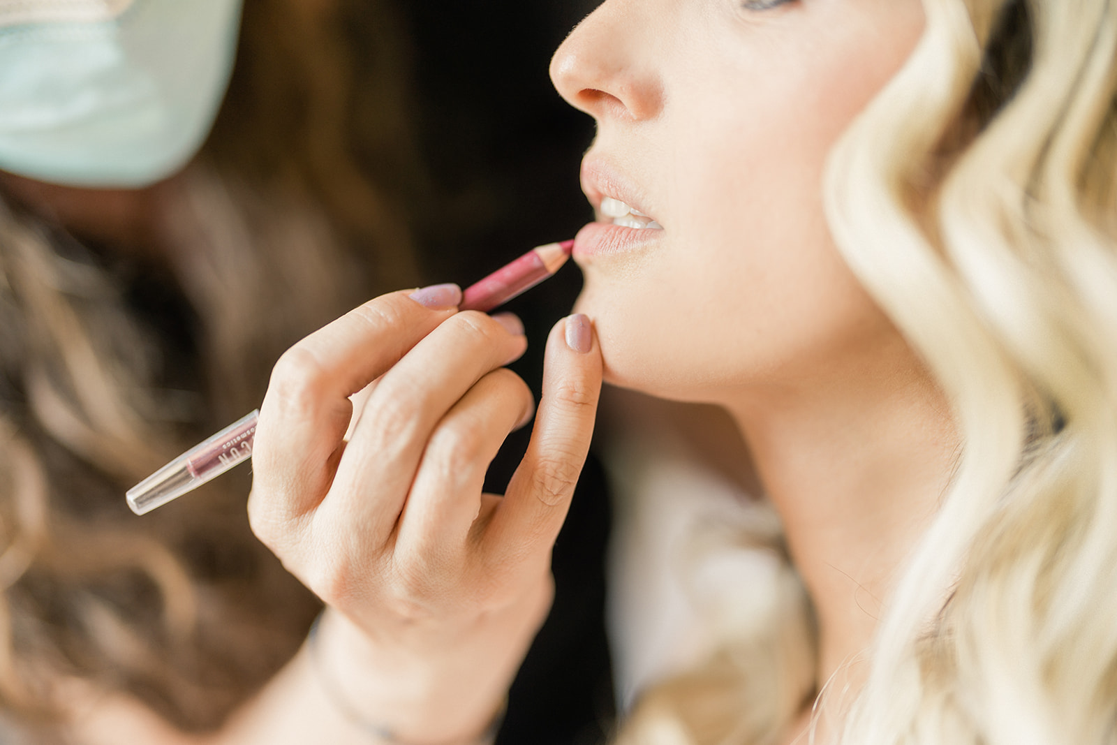
A questo punto passate alla stesura vera e propria del rossetto, cominciando con una lip pencil il più possibile simile al colore del lipstick che avete scelto. Insistete negli angoli interni per enfatizzare l’ombra e far sembrare le labbra più piene. La matita va sfumata sull’intera mucosa labiale; adesso è il momento del rossetto, che è preferibile applicare con un pennellino apposito. Date una seconda passata dopo aver premuto le labbra su un fazzoletto e, infine, passate un velo di gloss solo al centro.

Photo Credit| Thinkstock

487 comments

comments user
Bernie Marturano

leadmatrixpro.click – Color palette felt calming, nothing distracting, just focused, thoughtful design.

comments user
Shamika Kallstrom

trafficflowpro.click – Navigation felt smooth, found everything quickly without any confusing steps.

comments user
Lewis Wentzlaff

ranksprint.click – Appreciate the typography choices; comfortable spacing improved my reading experience.

comments user
Micheal Mckibbin

promomatrix.click – Color palette felt calming, nothing distracting, just focused, thoughtful design.

comments user
Beulah Crandal

growthcruise.click – Loved the layout today; clean, simple, and genuinely user-friendly overall.

comments user
Mario Sholler

conversionboost.click – Mobile version looks perfect; no glitches, fast scrolling, crisp text.

comments user
Roderick Suen

elitefunnels.click – Mobile version looks perfect; no glitches, fast scrolling, crisp text.

comments user
Mike Larzelere

marketcruise.click – Bookmarked this immediately, planning to revisit for updates and inspiration.

comments user
Wally Freed

leadvoltage.click – Found practical insights today; sharing this article with colleagues later.

comments user
Ronny Gilkison

leadforgepro.click – Overall, professional vibe here; trustworthy, polished, and pleasantly minimal throughout.

comments user
Nga Gluckman

conversionpulse.click – Loved the layout today; clean, simple, and genuinely user-friendly overall.

comments user
Brooks Banick

adorbitpro.click – Mobile version looks perfect; no glitches, fast scrolling, crisp text.

comments user
Minh Silla

trafficprime.click – Loved the layout today; clean, simple, and genuinely user-friendly overall.

comments user
Marty Farruggio

growilo.click – Bookmarked this immediately, planning to revisit for updates and inspiration.

comments user
Kymberly Cienfuegos

seohub.click – Appreciate the typography choices; comfortable spacing improved my reading experience.

comments user
Tova Schollmeyer

clickvoyage.click – Appreciate the typography choices; comfortable spacing improved my reading experience.

comments user
Mitchel Williar

brandsprint.click – Mobile version looks perfect; no glitches, fast scrolling, crisp text.

comments user
Isabell Kaemmerling

funneledge.click – Mobile version looks perfect; no glitches, fast scrolling, crisp text.

comments user
Jarred Lapine

websuccess.click – Bookmarked this immediately, planning to revisit for updates and inspiration.

comments user
Randall Luneau

roiboost.click – Mobile version looks perfect; no glitches, fast scrolling, crisp text.

comments user
Sherry Curling

seostorm.click – Bookmarked this immediately, planning to revisit for updates and inspiration.

comments user
Toi Letscher

clickstormpro.click – Loved the layout today; clean, simple, and genuinely user-friendly overall.

comments user
Joy Wineinger

clickdynasty.click – Found practical insights today; sharing this article with colleagues later.

comments user
Hollis Macken

traffichive.click – Color palette felt calming, nothing distracting, just focused, thoughtful design.

comments user
Ty Weld

clickvolume.click – Mobile version looks perfect; no glitches, fast scrolling, crisp text.

comments user
Ward Ar

rankcraft.click – Bookmarked this immediately, planning to revisit for updates and inspiration.

comments user
Alvin Lenze

marketboostpro.click – Color palette felt calming, nothing distracting, just focused, thoughtful design.

comments user
Harvey Conmy

clickhustle.click – Color palette felt calming, nothing distracting, just focused, thoughtful design.

comments user
Danny Butler

leaddash.click – Mobile version looks perfect; no glitches, fast scrolling, crisp text.

comments user
Ila Mcdunn

clickmomentum.click – Color palette felt calming, nothing distracting, just focused, thoughtful design.

comments user
Tommie Kimm

marketoptimizer.click – Color palette felt calming, nothing distracting, just focused, thoughtful design.

comments user
Darren Paolino

hyperleads.click – Bookmarked this immediately, planning to revisit for updates and inspiration.

comments user
Marty Farruggio

clicklabpro.click – Bookmarked this immediately, planning to revisit for updates and inspiration.

comments user
Dexter Tishler

leadharbor.click – Overall, professional vibe here; trustworthy, polished, and pleasantly minimal throughout.

comments user
Michel Zanella

clickvortex.click – Mobile version looks perfect; no glitches, fast scrolling, crisp text.

comments user
Diego Flemm

leadorigin.click – Mobile version looks perfect; no glitches, fast scrolling, crisp text.

comments user
Pinkie Laura

clickpremier.click – Bookmarked this immediately, planning to revisit for updates and inspiration.

comments user
Alexander Medows

clickfire.click – Appreciate the typography choices; comfortable spacing improved my reading experience.

comments user
Lucrecia Simoniello

trafficgenius.click – Navigation felt smooth, found everything quickly without any confusing steps.

comments user
Courtney Nagengast

clickcatalyst.click – Color palette felt calming, nothing distracting, just focused, thoughtful design.

comments user
Forrest Orbin

adoptimizer.click – Appreciate the typography choices; comfortable spacing improved my reading experience.

comments user
Doug Svendsen

leadvelocity.click – Color palette felt calming, nothing distracting, just focused, thoughtful design.

comments user
Tonda Lundgreen

seoquantum.click – Content reads clearly, helpful examples made concepts easy to grasp.

comments user
Tesha Mcever

admetric.click – Mobile version looks perfect; no glitches, fast scrolling, crisp text.

comments user
Shawna Buttars

clickfunnelspro.click – Navigation felt smooth, found everything quickly without any confusing steps.

comments user
Wynona Leidholt

clickauthority.click – Content reads clearly, helpful examples made concepts easy to grasp.

comments user
Garland Arenburg

trafficpilotpro.click – Mobile version looks perfect; no glitches, fast scrolling, crisp text.

comments user
Vince Stohler

adblaze.click – Pages loaded fast, images appeared sharp, and formatting stayed consistent.

comments user
Stephan Nace

boostfunnels.click – Content reads clearly, helpful examples made concepts easy to grasp.

comments user
Seymour Devor

rankdrive.click – Content reads clearly, helpful examples made concepts easy to grasp.

Commento all'articolo

Acconciature